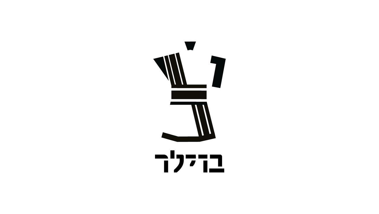
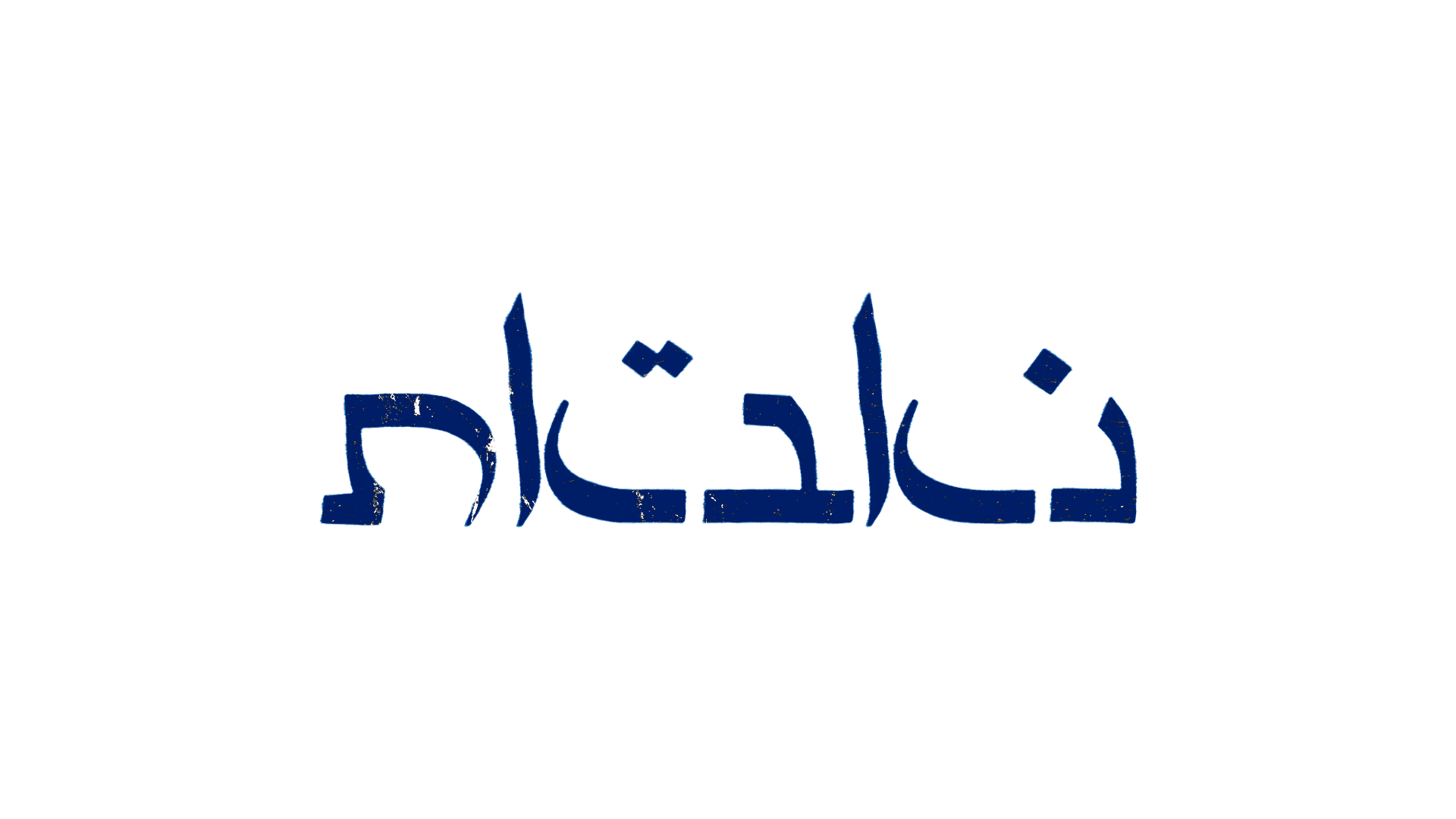
Nabat logotype, lettering,
Nabat is a a visual identity project that was done in HIT Visual communication degree.
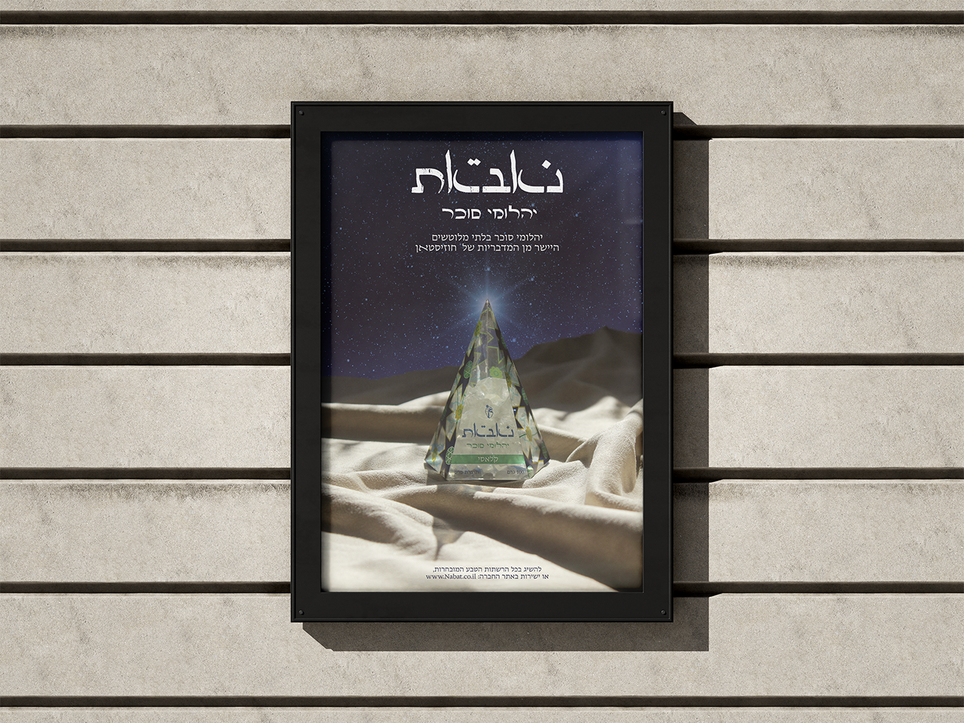
nabat, also known as rock candy or rock sugar, is a traditional type of sugar used in Persian cuisine as a sweetener, and know for its medicinal effects.
When i approached to this project i decided to focus on the persian culture, and magical look this hard rock candy has.

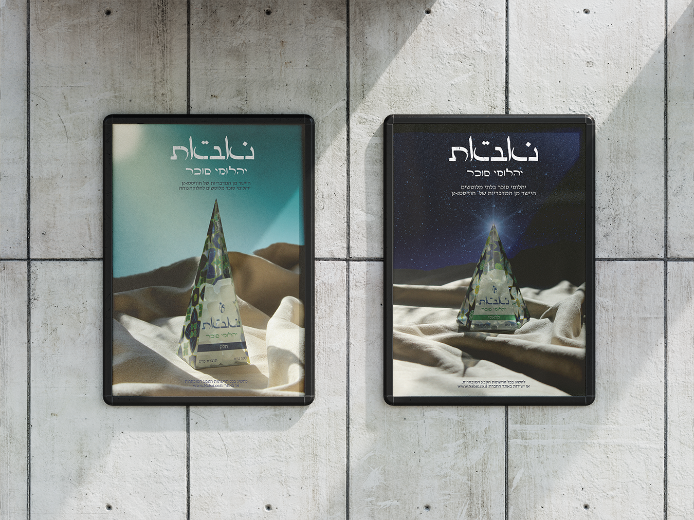
Three types of packages, (from right to left) Smooth, Saffron, and Classic
Designing the packages, i chose a strong graphic geometric patterns following the patterns of persian mosks, combined with the unusual triangular shaped packages applying the mysterious and magical sense to the brand visual identity while referencing to a few arabic and persian cultural and religious symbols.


Packaging, Photos, and package design was done by me